Notes
How the Blue Crow prototype works and why it is built the way it is. The prototype itself is live and responsive: open it on a phone for the mobile-first experience, on a laptop for the desktop adaptation. Everything below is the reasoning behind it.
Concept
- One stage
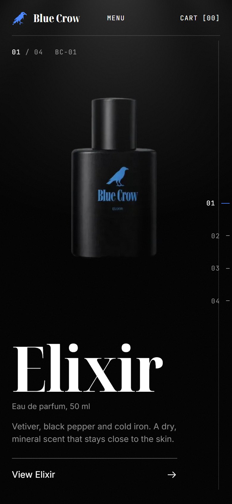
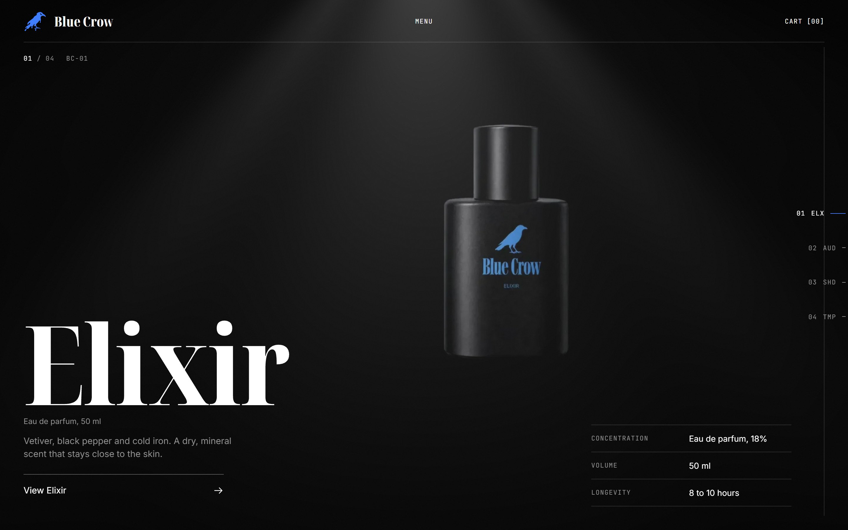
The homepage is a single black stage. Four products pass through it one after another, each holding the full screen. The product is the only thing lit; the interface stays in the margins.
- One line
The thin dividing line from the brief is the connective device. It separates spec rows, underlines the header, and runs vertically down the right edge as the product navigator. When one chapter gives way to the next, the boundary between them is that same line travelling up the screen.
- Video from stills
No footage existed, so each product's video was generated from its still: cut out, placed on black, and turned into a slow orbital shot. Each shot was then split into 96 frames and arranged front, side, back, side, front. Scrolling drives the frames directly, so the video plays under the visitor's thumb rather than on a timer.
Homepage
- Loading
A counter runs 000 to 100 while the first product's frames arrive. The other three load in the background in order, so by the time anyone reaches chapter two it is ready. Each product is under 1 MB on mobile.
- Chapters
Each chapter is pinned for about two screen heights. Within that distance the scroll position maps to the frame index, with a short ease so fast flicks feel weighted rather than jittery. Name, descriptor and the route to the product page reveal once the chapter is in place; they fade before the chapter slides out so nothing collides with the header.
- Navigator
The vertical spine on the right lists 01 ELX, 02 AUD, 03 SHD, 04 TMP. The white fill shows how far through the sequence you are; the blue tick marks the active chapter. Tapping an entry scrolls to that chapter. Arrow keys and page keys do the same on desktop.
- Transition
Chapters push, they do not crossfade. The incoming chapter arrives with its top line first, then its product. Cheap on mobile GPUs, and the movement of the line is what makes four sections read as one film.
- Between pages
Opening a product drops the same five black panels the menu uses, the page changes underneath, and the panels lift only once every frame of that product is decoded. The visitor never sees a half-loaded turn, and the two pages read as one space.
- Light and grain
A single soft top light (a small WebGL shader) sits over the whole stage and leans slightly toward the cursor on desktop. A faint animated grain keeps the black from reading as a flat fill. Both are low-cost and both switch off under reduced-motion settings.
Product page
- Rotate by hand
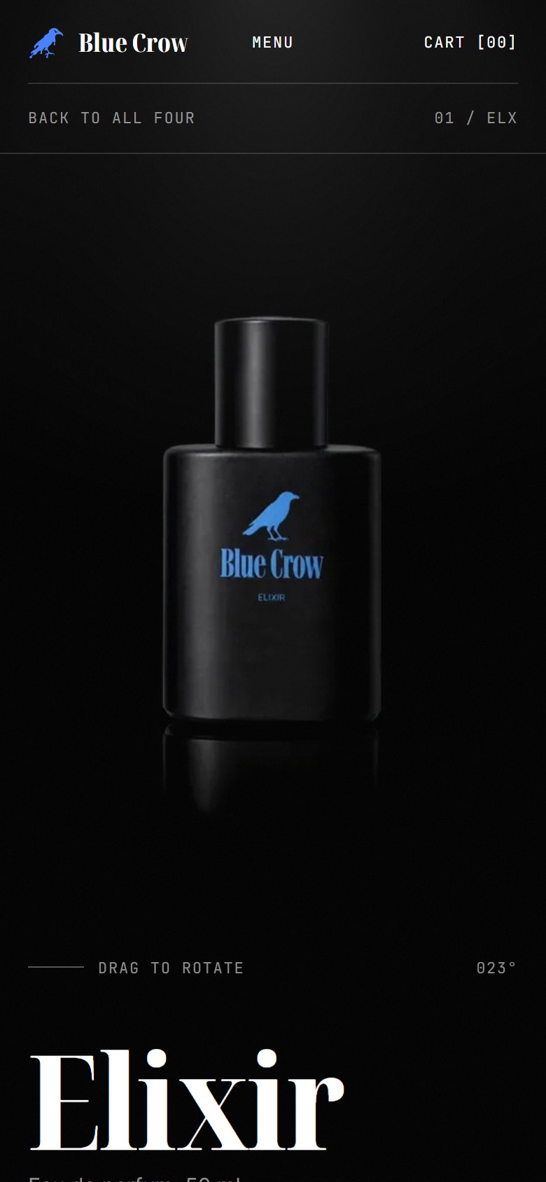
The same frame sequence continues on the product page, but here it is driven by dragging. A full pass across the media is one full turn; the angle readout in the corner ticks as you go. Left alone, the product turns slowly on its own.
- Buying
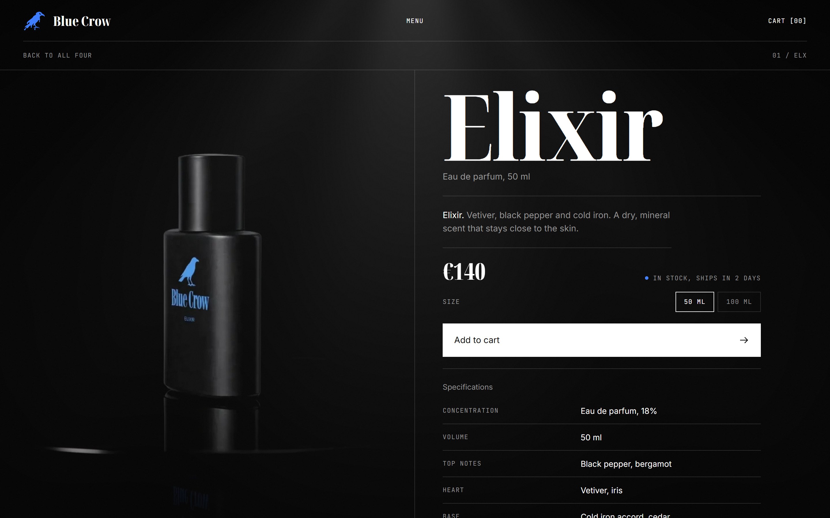
Price and stock sit on one line, the option row below it, then a single full-width action. On mobile, once that button scrolls out of view a bar with price and Add to cart docks to the bottom edge, so purchase is always one tap away. Adding updates the cart count in the header and confirms with a short message.
- Specifications
Labels left, values right, one thin line per row, no boxes. The three most decisive rows also appear on the homepage chapter on desktop, so the two surfaces share a language.
- Desktop
Media pins to the left half while the information column scrolls on the right, so the product is always in view while reading.
Motion inventory
- Loading
The Bluecrow crow is drawn as a single white outline while the counter runs, then fills blue; the loader slides up once the first product is fully decoded.
- Scroll
Each chapter maps scroll position to the product's rotation, with a slow push-in to the middle of the turn and pull-back by the end. Tapping the product, its name or the View link opens the product page.
- Chapter change
The incoming chapter pushes the previous one up, its top line leading; the outgoing product fades before it reaches the header so nothing is ever cut off.
- Menu
Five black panels drop from the top, the four names slide up in sequence. On desktop, hovering a name shows that product on the right while the others dim.
- Page change
The same five panels close over the homepage, the product page loads underneath, and they lift only when every frame of that product is ready.
- Rotate
On the product page the product turns by dragging, a full pass across the media is one full turn; left alone it turns slowly on its own.
- Add to cart
A copy of the product lifts off, flies into the cart button and shrinks away; the cart count bumps and flashes blue as it lands, the button reads Added for a moment.
- Ambience
A soft top light that leans toward the cursor, a faint film grain over the whole stage, and in the footer a field of thin vertical lines that drift and bend around the cursor. All three are quiet by design and switch off under reduced-motion settings.
Required views
System
- Colour
Pure black background. White for names, prices and actions. Grey for descriptors, labels and inactive navigation. Blue appears once per screen: the active navigator tick on the homepage, the stock indicator on the product page, and keyboard focus.
- Mark
The crow in the header, the favicon and the loader is the Bluecrow logo from the mood board, traced to a vector so it stays sharp at any size. The plain crow silhouette stays where the client put it, on the products themselves.
- Type
Headlines are set for Mencken Std Head Compressed Extra Bold. The font is not included in this prototype for licensing reasons; Noto Serif Display in its extra-condensed black cut stands in and swaps out automatically when the Mencken files are dropped into the fonts folder. Inter carries the interface, a monospace face carries codes and spec labels.
- Build
Plain HTML, CSS and JavaScript with GSAP for scroll handling. No framework, no build step. The product data is one file, so the same page renders all four products and a real catalogue could feed it directly.
- Next
For a live store: real footage or higher-quality renders in the same pipeline, a cart drawer, and a Shopify storefront behind the buy action. The layout and motion carry over unchanged.